
BRIEF
I began my Masters program with Georgetown University in the spring of 2019. The program is ‘Masters of Design Management & Communications.’ In my first semester, I took Ethical Design and Design Leadership. Both classes challenged me to reflect on ways to grow personally and professionally.
This covers my final assignment, which focused on generating a code of ethics to guide future design decisions.
ethical design. Georgetown. MPDC 500.
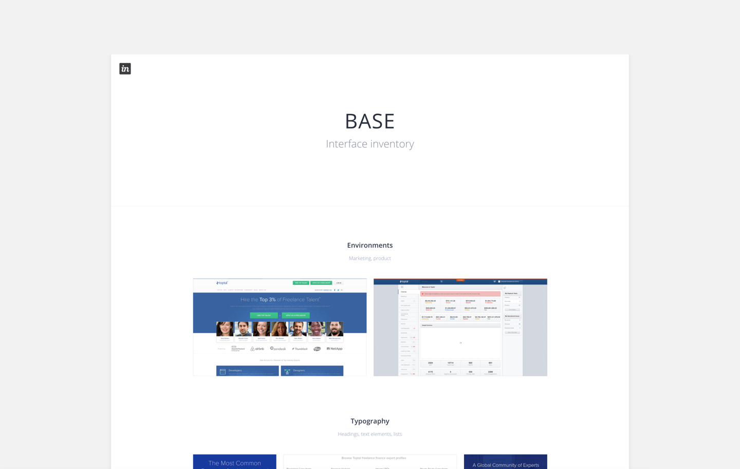
Figure 1: Collection of BASE website designs.
OVERVIEW
Before we discuss Toptal’s design system, we should discuss Toptal.
Toptal is a freelance network that connects talented engineers and designers with top-tier companies across the world. We are a small, global company that was started by a group of engineers. Our core product is a web-application that connects available talent with clients. Toptal staff act as moderators and are one of the three main user groups, in addition to the talent and clients.
The Toptal platform has remained largely unchanged since it was debuted in 2010. Changes and updates have primarily been made in isolation and on new features or sections. This stagnation has created many problems, one of the largest being that Toptal doesn’t reflect the same professionalism, creativity, and technically-savvy personality we demand from users. When I joined the team, I remember thinking that the interface felt like a legacy product; it looked outdated and neglected. It was clear it hadn’t been updated in years.
In addition to an outdated appearance, inconsistencies riddled our UI. Toptal designers and developers were largely on different pages when it came to making any changes in the UI. The small design team relied on a handful of text styles, color swatches, and logo’s that were passed around and shared via Google drive. There was no system in place to ensure that the fundamental UI elements that designers created had their matching counterpart in code.

Background.
After joining the Toptal design team (as the second UX designer), I spent weeks shadowing calls between team members and users. It didn’t take long to pick up on a pattern. Users overwhelmingly reported negative experiences, ranging from completing basic tasks to understanding complex workflows.
There needs to be more collaboration between the design and engineering teams. Anything to address the inconsistencies plaguing our UI.
- Courtney M.
I began poking around the internal design and development Slack channels to see what was being done to address these problems. Engineers surfaced concerns about receiving similar, but not exact designs from various team members. Designers were frustrated with the slow pace and tediousness of recreating elements repeatedly.
I discussed the notion of creating a design system with my team. The response was mixed. Some were fearful that it would disrupt the current process and actively work to erode each designers creativity. Others were supportive and excited about the idea of having a single source of truth. As a new designer, I hadn’t taken on any projects and floated the idea of starting a design system. I was given the green-light to spend a portion of my time researching and building a design system.
PROCESS
I knew this was a huge opportunity. There was no system in place and the team seemed frustrated with having to repeatedly build the same UI patterns. I began by developing a process that would allow me to move quickly and efficiently.
Research and organization
Principles and beliefs
Design directions
Create solutions
Give it depth
Scale it
1. Research and organization
I began by conducting an audit. I focused on our landing pages (user is logged out) and our platform (user is logged in). These UI’s covered an overwhelming majority of user experiences.
I used CSS Stats, gathered screenshots, video clips, design files, and prototypes to understand every experience that was live and the work that went into creating it. I organized the findings by subject and created InVision boards for brand/marketing and product environments. I started with styles (colors, fonts, logos, icons) and worked through components (buttons, avatars, dropdowns, etc.) and patterns (modals, wizards, steppers, etc.). After conducting the audit, here is a sample of what I found:
10+ button styles
24 unique font sizes
14 background colors
54 text color variations
8 logo variations
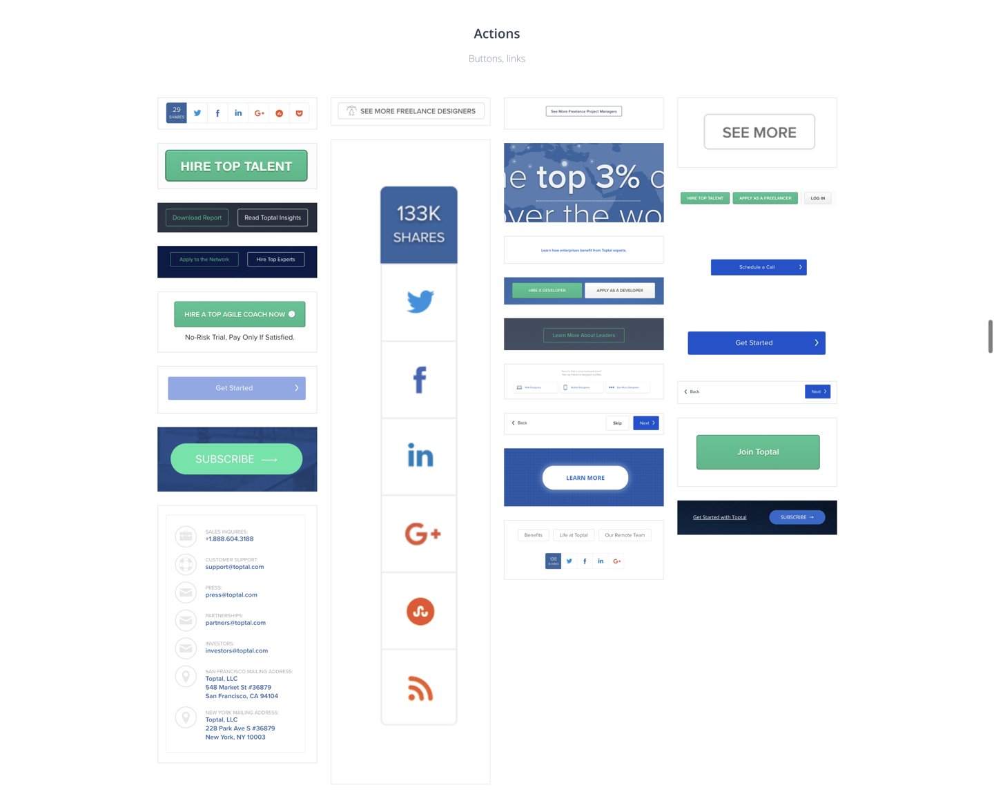
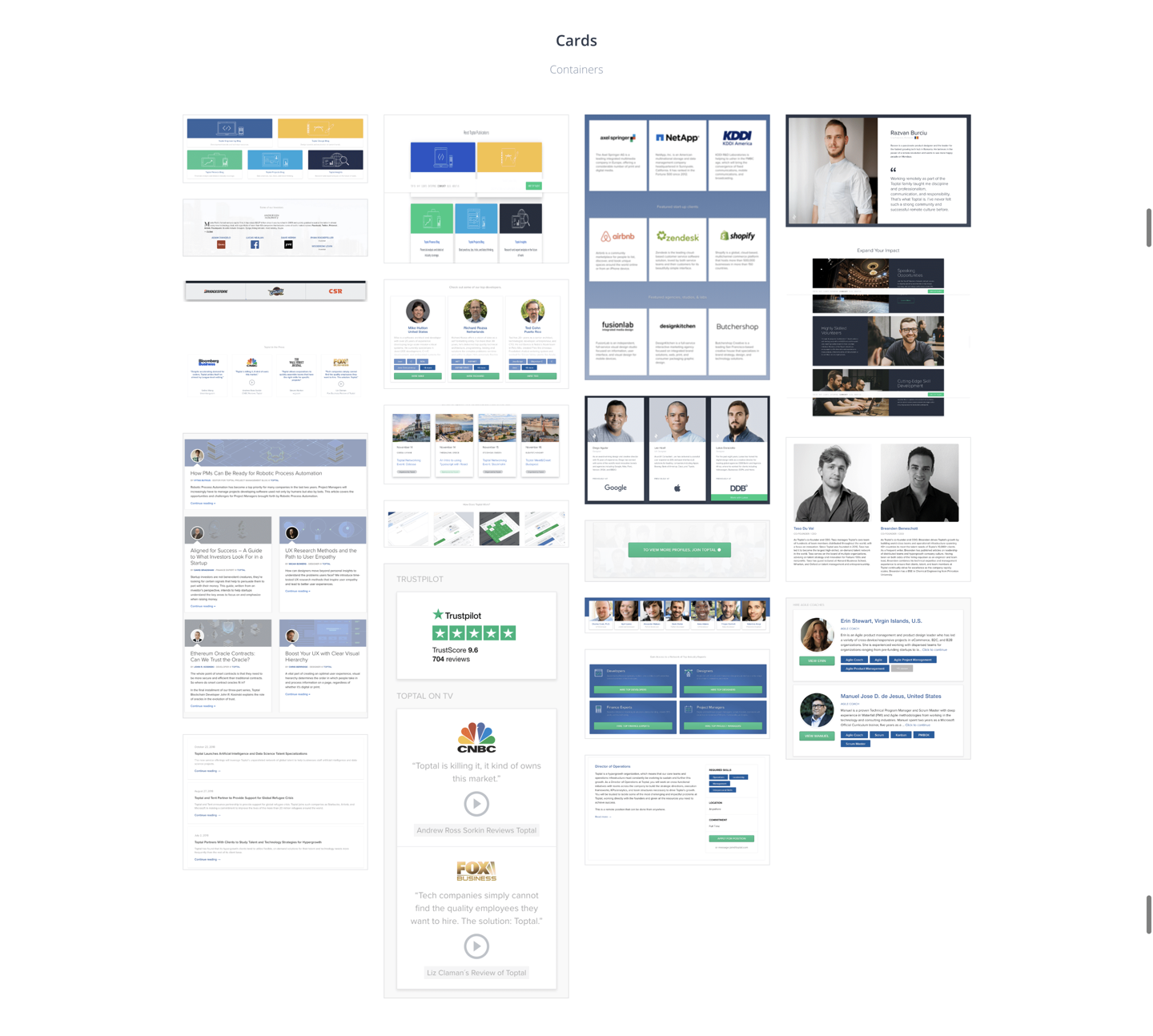
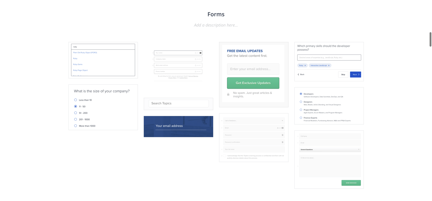
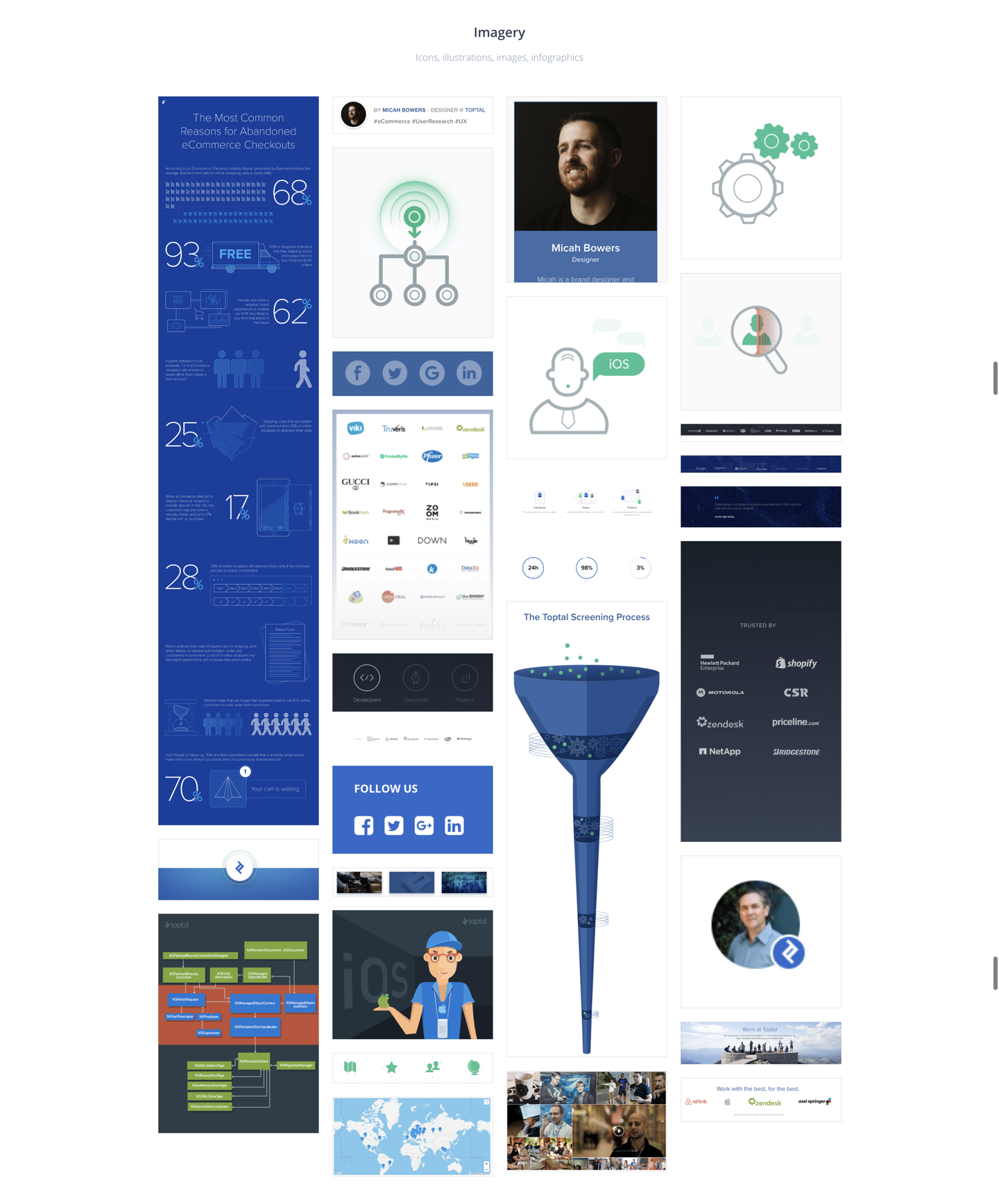
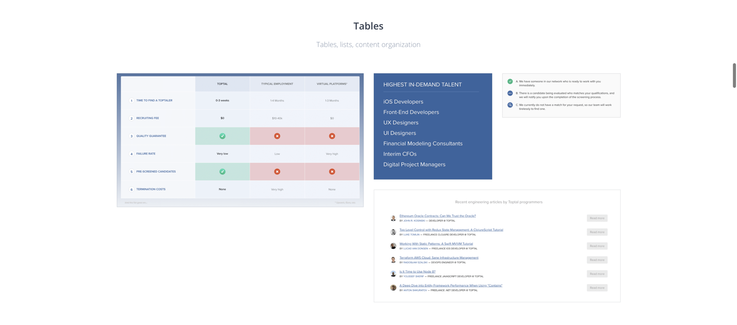
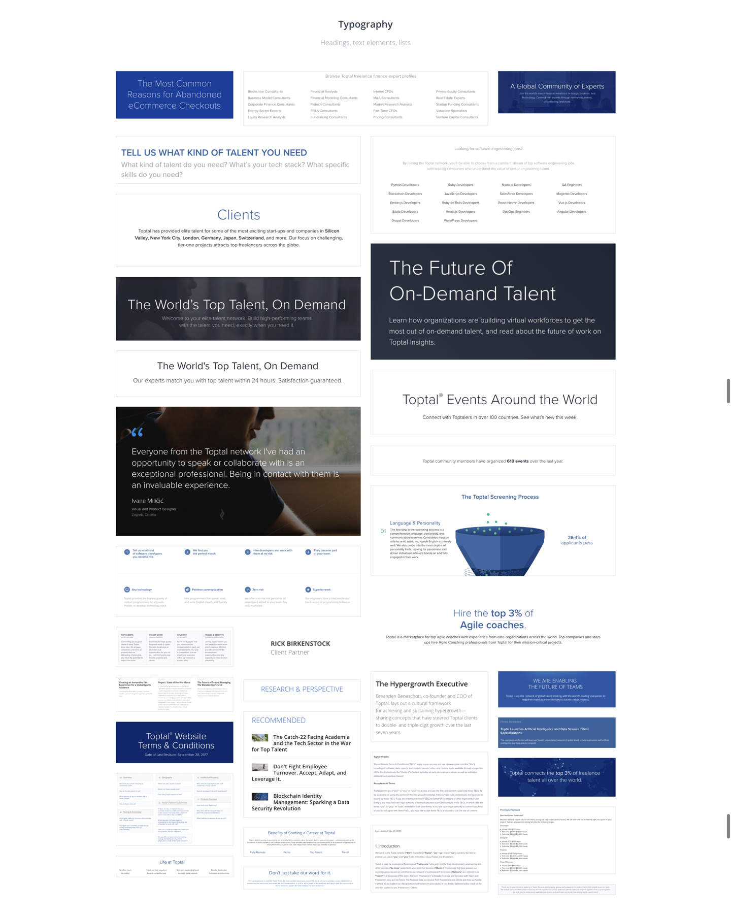
There was clearly a problem. Nearly every UI element had multiple variations that were similar, but inconsistent when inspected closely. Since there was no source of truth amongst the design team, very few elements matched. Buttons were similar, but slightly off. Some were rounded, some had hard corners. There were shadows on some and missing on others.
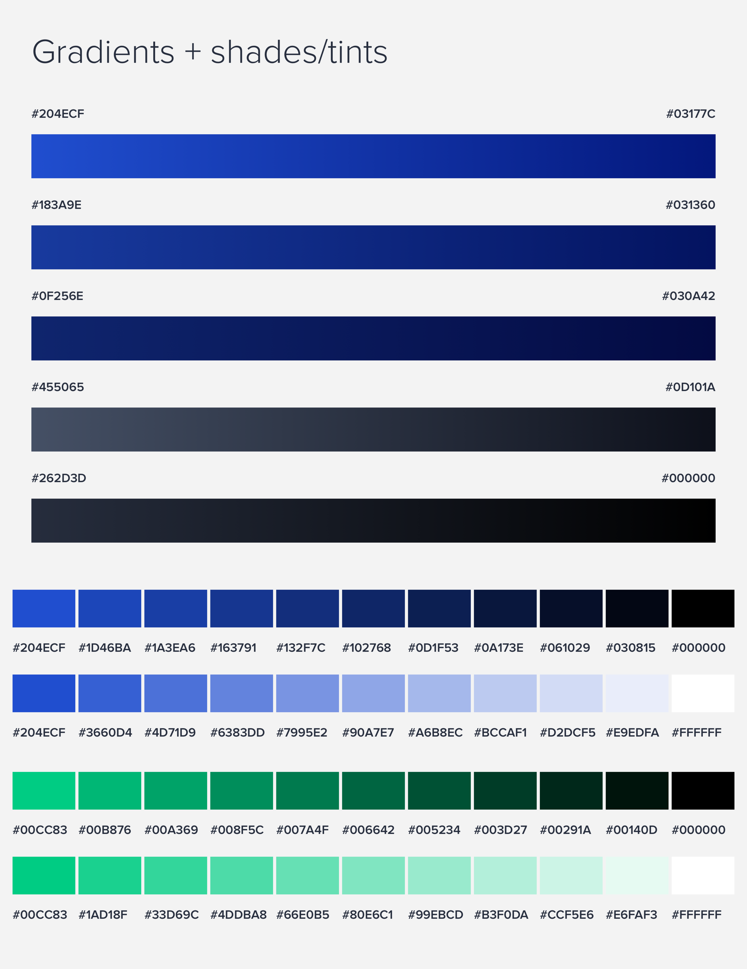
The use of color seemed to carry no meaning across elements. Brand and marketing pages used green as the primary color while product used blue. Gradients were heavily used but wildly inconsistent in angle, opacity, and color choices. Multiple font families were also used, seemingly interchangeably. This was particularly confusing because the text differences didn’t map to areas or topics within the UI.
Figure 2: Results for Toptal.com from CSS Stats.
2. Principles and beliefs
After completing the audit, I began to document what would be needed to support our current product. Despite having a range of design solutions for some components, I knew there was a collection that would need to be supported immediately. Before creating a style to use, we would need to define a set of design principles.
Our design team had weekly meetings to have open discussions. I began using this time to solicit input about what our design principles should be. Nothing like this currently existed so it was our chance to define them. I asked the team…
What is Toptals purpose?
What is important to you?
What do we prioritize?
What inspires you?
What is our key offering?
How do we want users to feel?
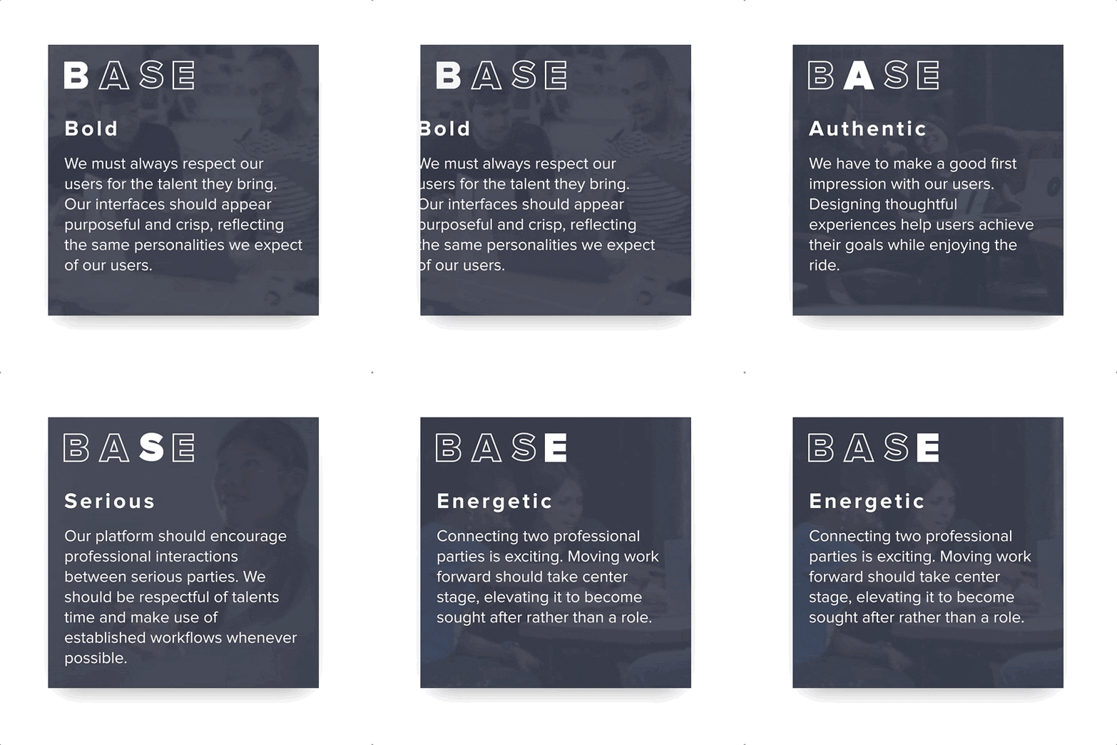
Figure 3 + 4: Bold. Authentic. Serious. Energetic.
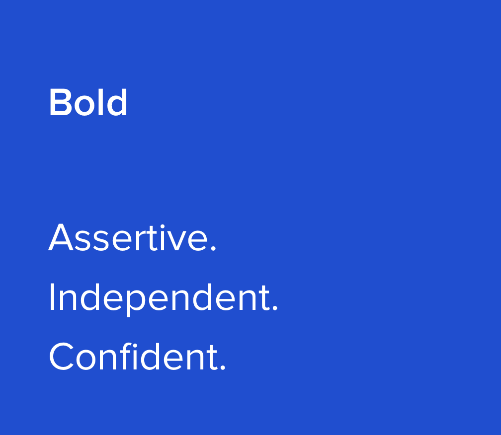
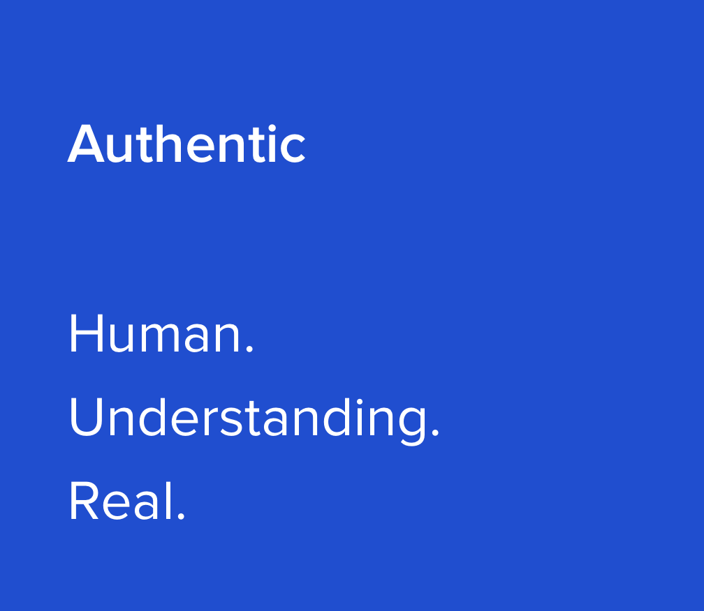
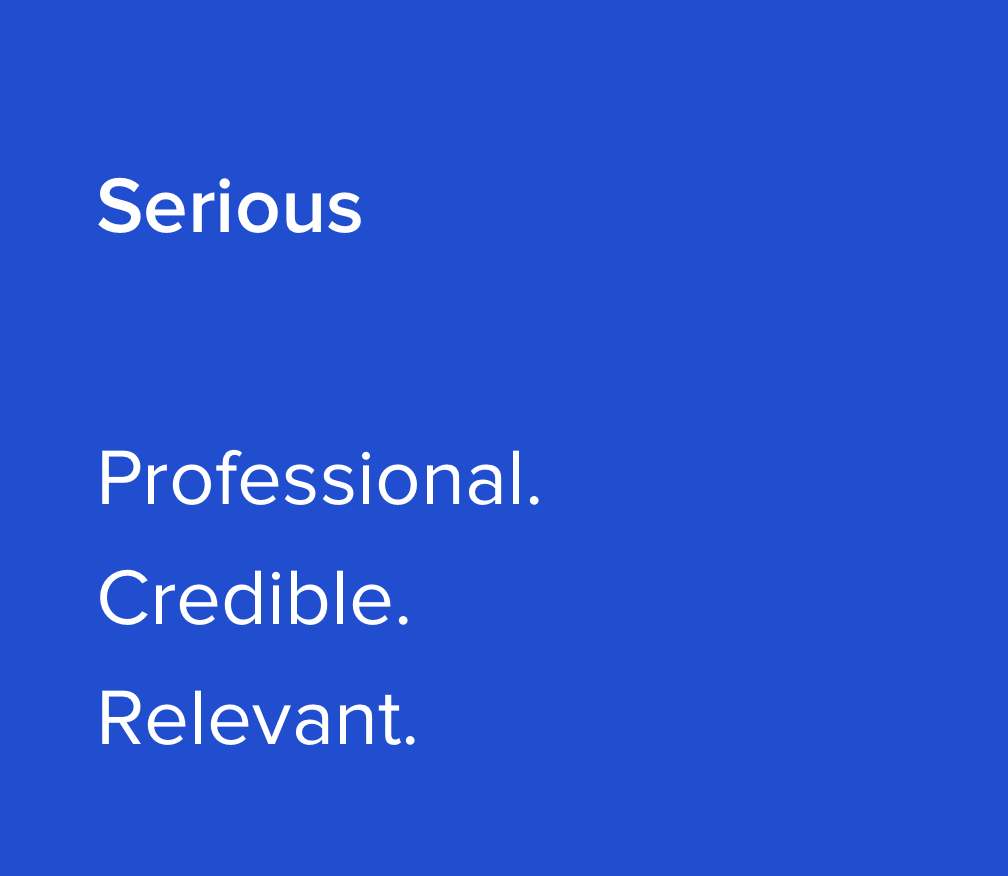
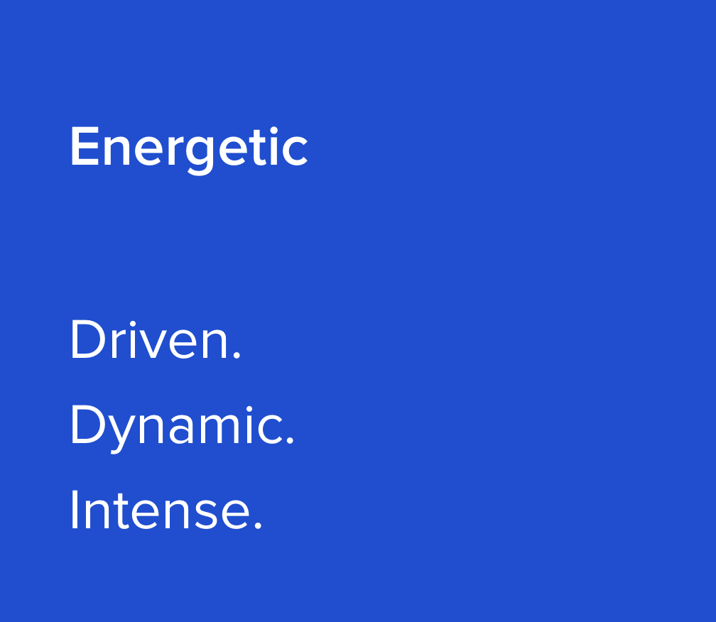
Lots of different ideas were surfaced and organizing them was more difficult than expected. Some felt reused, others generic. Some even conflicted with others ideas. After a lot of review and deliberation, a set of four principles was decided upon.
Later, when BASE was made available to team members across Toptal, we heard about teams using these principles when tackling their own difficult decisions. By giving others a peek into our design process, we had invited them to problem solve like a designer.
3. Design directions
With principles established, I met with other designers to explore future design concepts. Nothing was off the table. These explorations were meant to be quick and high-level.
The results were fantastic and the team had a blast. By this time in the process, some designers had not been able to contribute any time to BASE because of their other work. I was spending nearly all my time on it and this was a fun exercise to get other team members involved.
Figure 5: Design concepts explored.
4. Create solutions
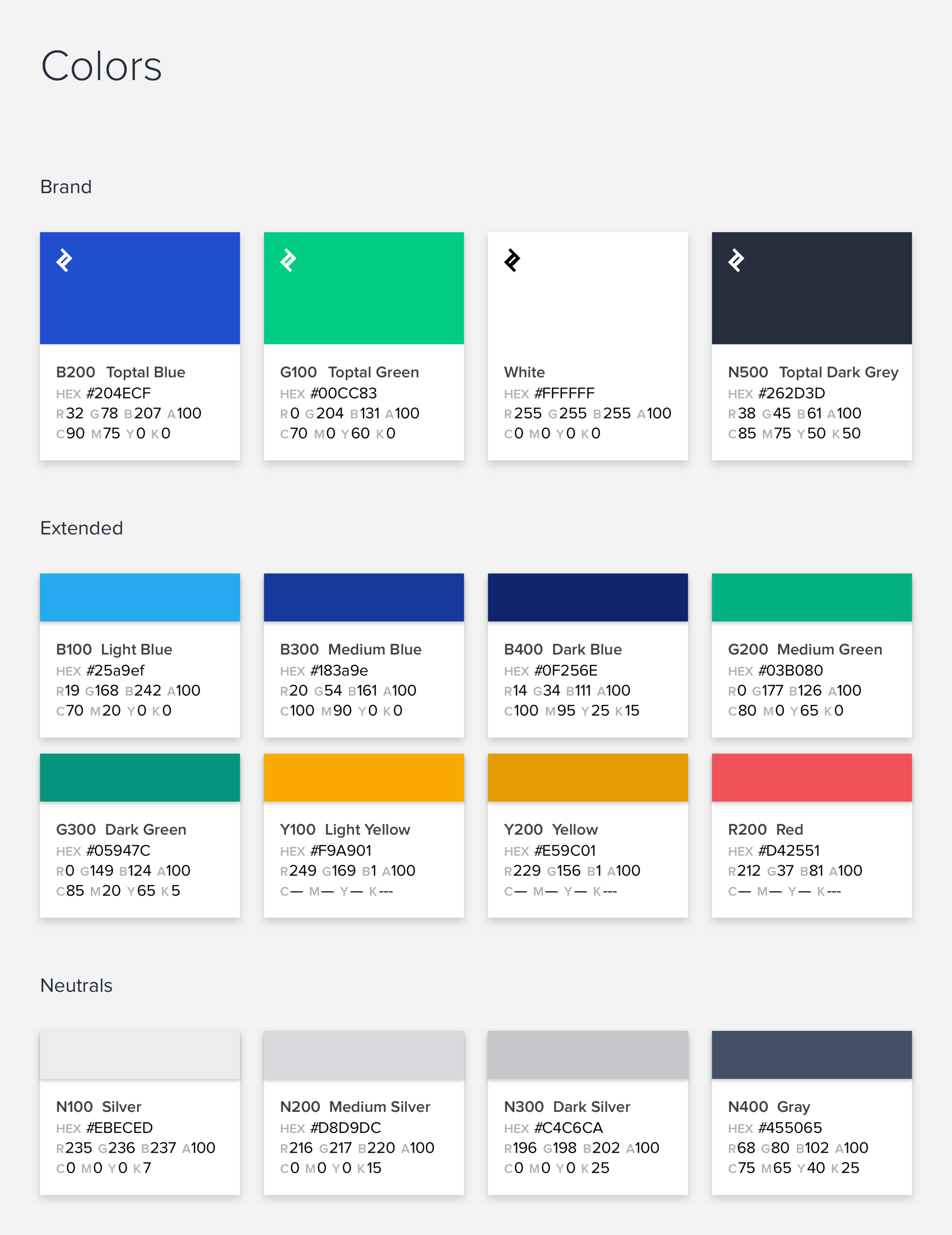
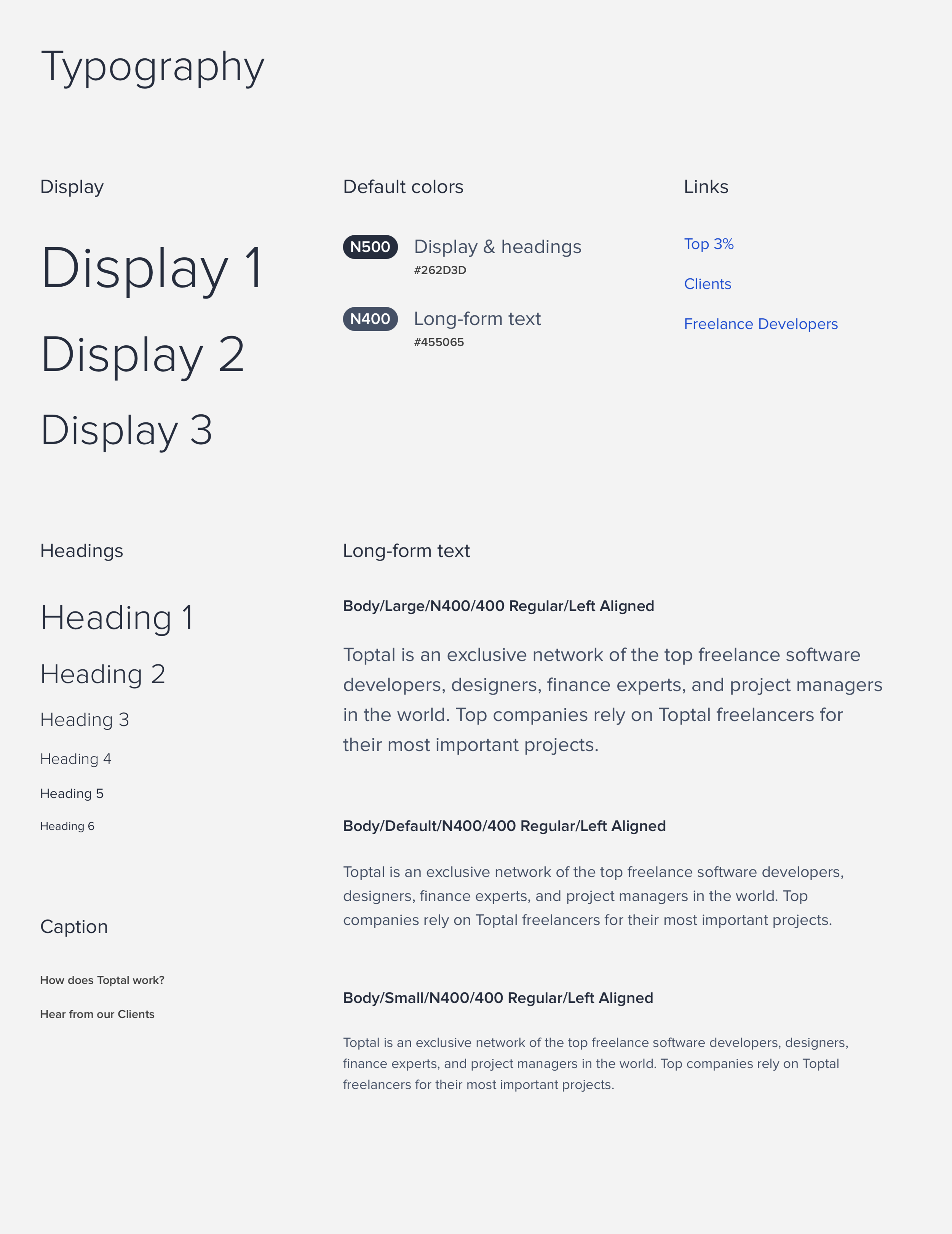
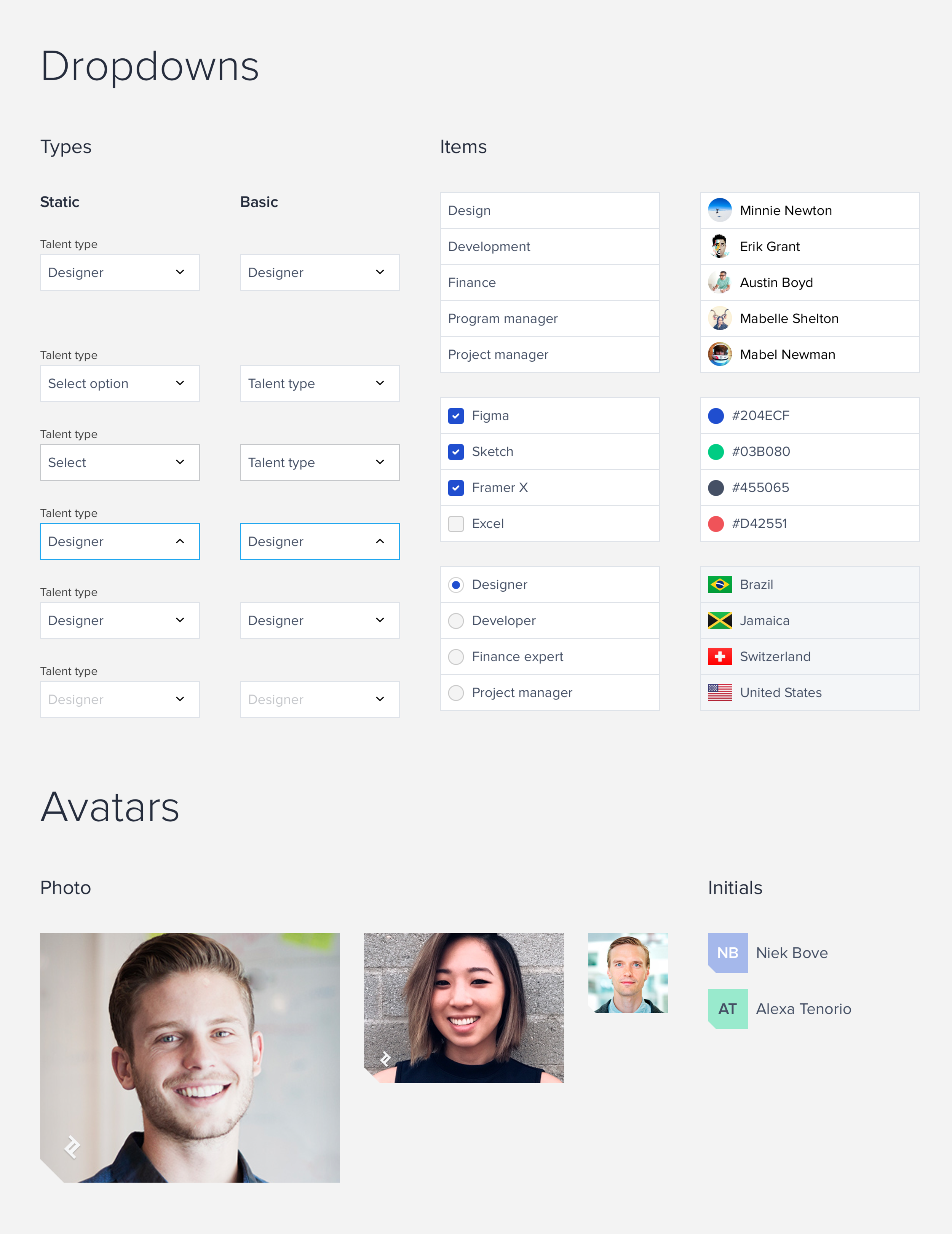
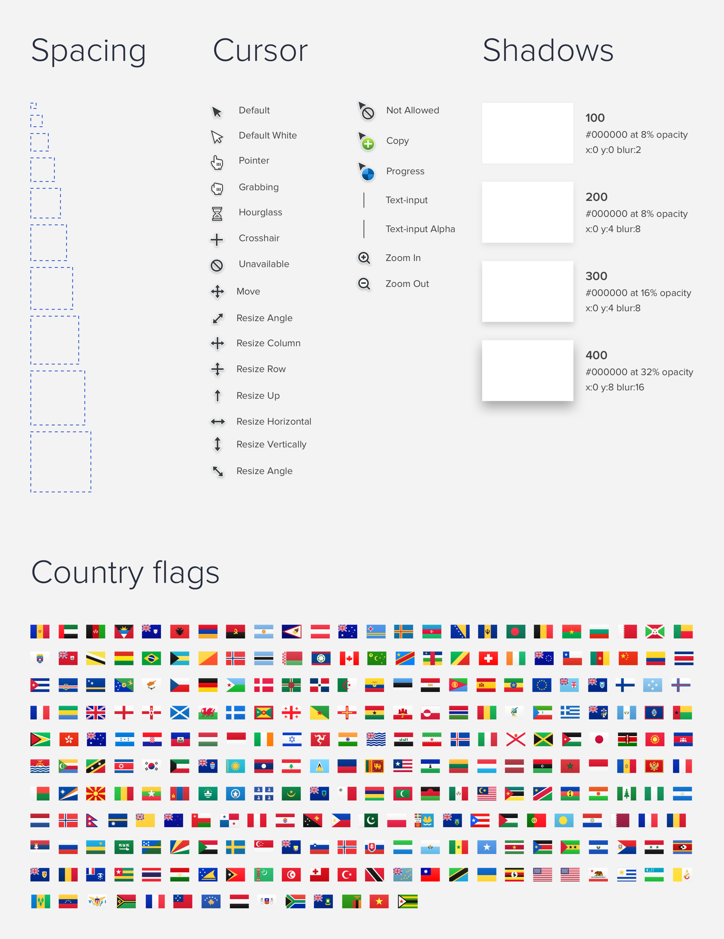
Once we had a few solid design directions, I used them as inspiration to build components and patterns. I chose to incorporate the tried-and-true Atomic Design approach, establishing core styles like colors, fonts, shapes, etc. and combining them to make buttons, avatars, inputs, and other UI elements.
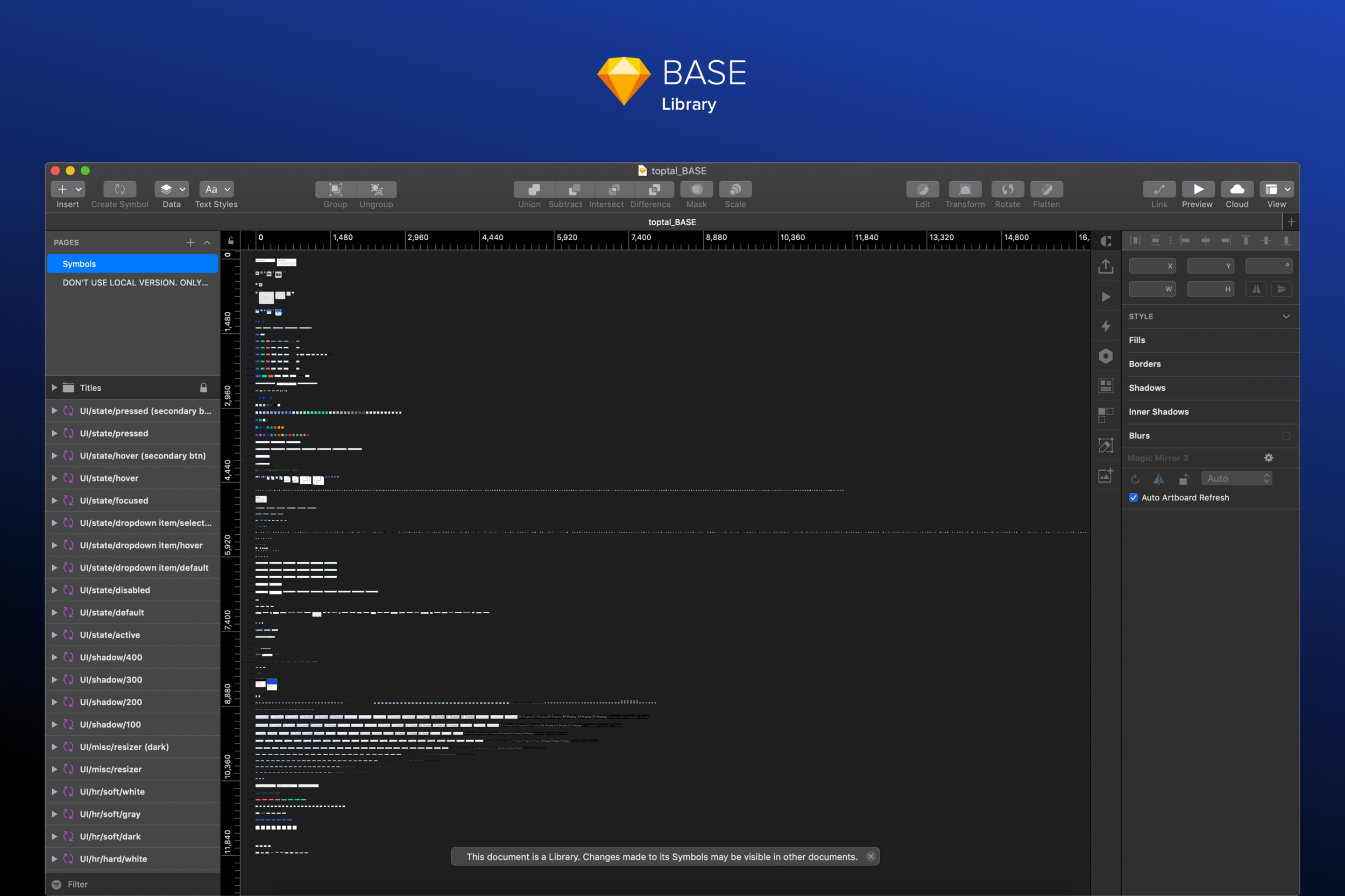
To make sure I had correctly applied the agreed-upon aesthetic, I provided regular status updates during our weekly design syncs. I also utilized the library function within Sketch to easily distribute the growing collection of elements to other designers. They would have instant access to all components across every design file.
Sometime around this stage, word had gotten out about what I was working on. A Toptal front-end developer reached out on Slack about wanting to contribute to BASE. Vytautas was the perfect addition. Passionate, curious, and a damn hard worker, he went to work researching how to translate the Sketch library into live, shareable code. We chose to pair Semantic UI with React.js so elements could be easily altered and swapped by future product teams. Having an engineering counterpart began to point BASE towards a truly unified and holistic design system.
5. Give it depth
To ensure BASE would be successful, it needed to be more than a Sketch library. It needed to empower teams to build with confidence. As more components and patterns were added to the Sketch library, I began spending more time writing documentation to illustrate how to use the UI elements properly. This included:
best practices
do’s and don’ts
accessibility guidelines
common downloads, and more
6. Scale it
One of the initial problems Toptal product teams faced was sharing visibility and information across roles. Designers and developers working on the same project were separated by location (Toptal is a remote company) and use of different sets of tools. BASE aimed to make the resources visible to all users by housing all aspects and definitions in a single place.
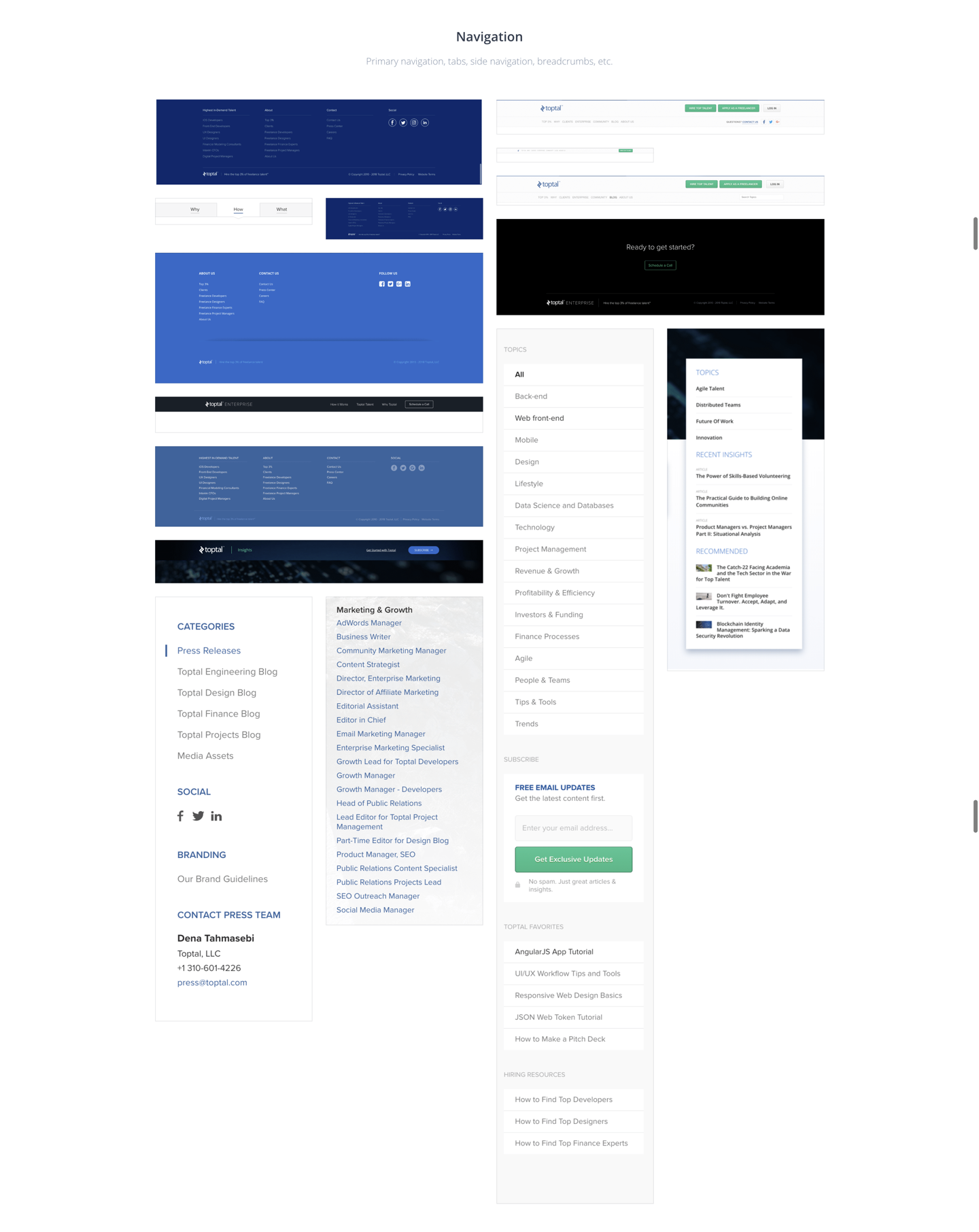
To make BASE accessible to the broader team, a website was built that quickly began to function as the single source of truth. Visitors could learn about BASE by exploring brand, marketing, or product specific sections. Dedicated resource sections were added that included access to the Sketch library, sticker sheet, version notes, our favorite plugins, and more. Developers had easy access to implementation notes and code repositories.
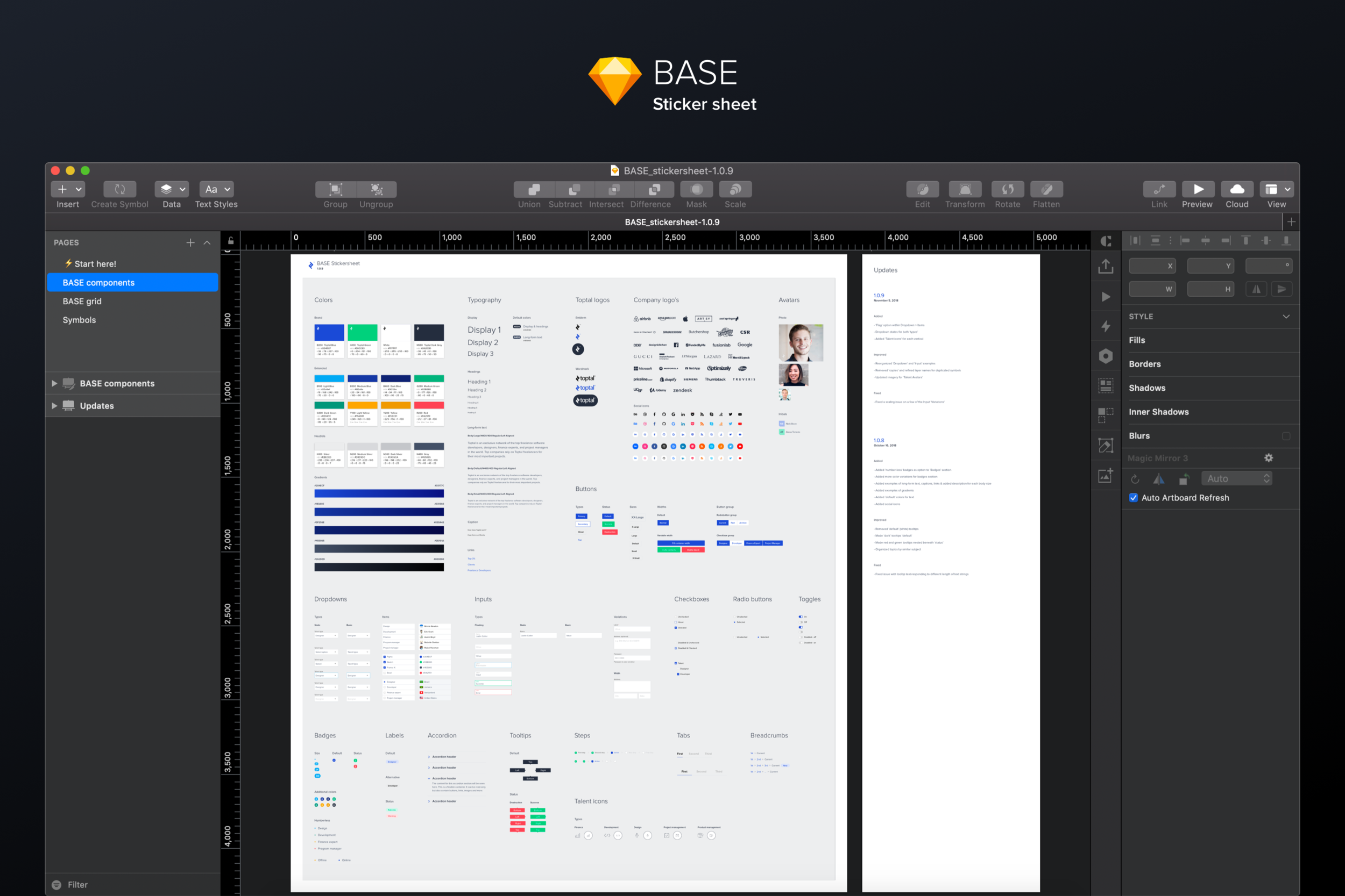
Figure 6: Collection of BASE products. I began this project with the goal of providing our design team with shared tools. That has expanded to encompass (from left to right) a Sketch Library, Sketch sticker sheet, website, developer guidelines, Slack support + contact channels.
WHERE WE
ARE NOW
Rollout
Getting teams to start using BASE wasn’t going to happen immediately or easily. BASE wasn’t just a redesign, it represented a completely different way to approach our work.
The library is constantly growing and changing as feedback from the team is logged. Since the library is built with an atomic focus, changes are (for the most part) very easy and quick to implement. Some of the things we have noticed since using BASE:
the time to develop new features by reusing existing components is a huge time saver that designers, developers, and other team members can all agree on
BASE encourages more communication about best practices, accessibility, and responsive design
having a central repository of frequent downloads has given more time back to managers and product leads
Sticker sheet
Once the design team had access to the library, some requested that a sticker sheet be made available. The sticker sheet includes instances of every symbol, with various overrides that show the flexibility of every live component. As powerful as the library is, making changes to borders and background colors can be a challenge. Having access to examples of common controls made the BASE library less daunting.
BASEbot
To help manage requests, feedback, and common design inquiries, I thought it would be helpful to automate some processes. I thought a simple Slack bot could help the BASE team by pinging team members with occasional information and help answer questions that we regularly received from outside team members. I posed the question on our BASE Slack channel, getting the attention of an engineer who loved to tinker with bots. He was able to build a bot that was simple in nature and answered basic questions, such as:
What are Toptals colors?
What font family should I use?
Where can I access Toptal logos?
I have a design question. Who should I contact?
We named it BASEbot and it has been chugging away for months. I’d like to return to the bot and explore how to integrate deeper into our system.
We have also made small improvements that don’t add elements to the system but make it more enjoyable to use. The BASE website now uses the same encryption and account authentication that other Toptal internal tools use. This means that as long as the user accesses the BASE website in the same browser they are logged in to their company email, they are automatically validated and granted access.
LESSONS
LEARNED
What’s next
BASE has deepened my understanding of design systems. I learned to tell a better story, to improve my delivery and presentation skills, to rally and lead a team around a shared goal. I have learned to focus on the work that matters.
I am still leading the direction and design tooling for BASE. As the team looks ahead to what to focus on next, we find ourselves returning to the simple topics rather adding more elements. Here are some of the ideas the BASE team is considered next:
Mobile. Toptal began as a web-based application. It wasn’t until recently that creating a mobile application was a priority. The mobile team is working on taking the lessons learned from BASE and applying the same approach to their work. One of the challenges we are facing is ensuring the proper balance between platform specifics and our own principles. Apple iOS and Google Android have excellent documentation on how to best use their elements. The challenge we face is to respect their guidance while making sure it still feels like us.
Accessibility & localization. Toptal is a global company with users all around the world. Most of BASE passes AA accessibility standards and adapts to local languages and display orientations. This effort would strive to accurately measure our current accessibility and localization while striving to improve upon both.
Motion. We chose to focus our attention on the fundamental UI pieces first. Colors, fonts, buttons, and so on. We have a reached a point where we can expand and start to discuss more complicated topics that may impact most, if not all, elements.