
BRIEF
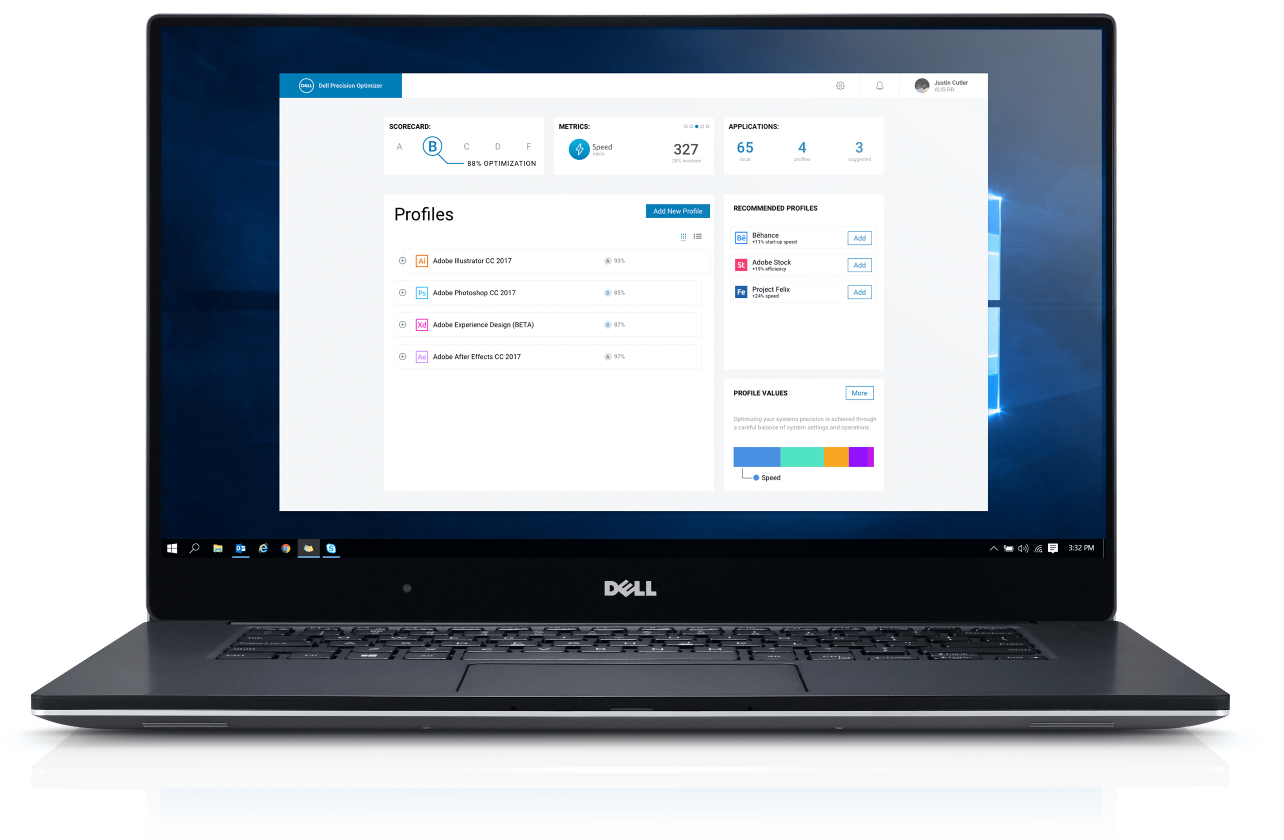
Dell Precision Optimizer (DPO) is a free software product ships with Dell Latitude and Precision systems. It is marketed to optimize the performance of your PC by creating unique profiles for commonly used third-party applications.
My goal was to simplify specific areas of the the interface and improve the overall user experience.
ui. ux. product design. future concept.
Background
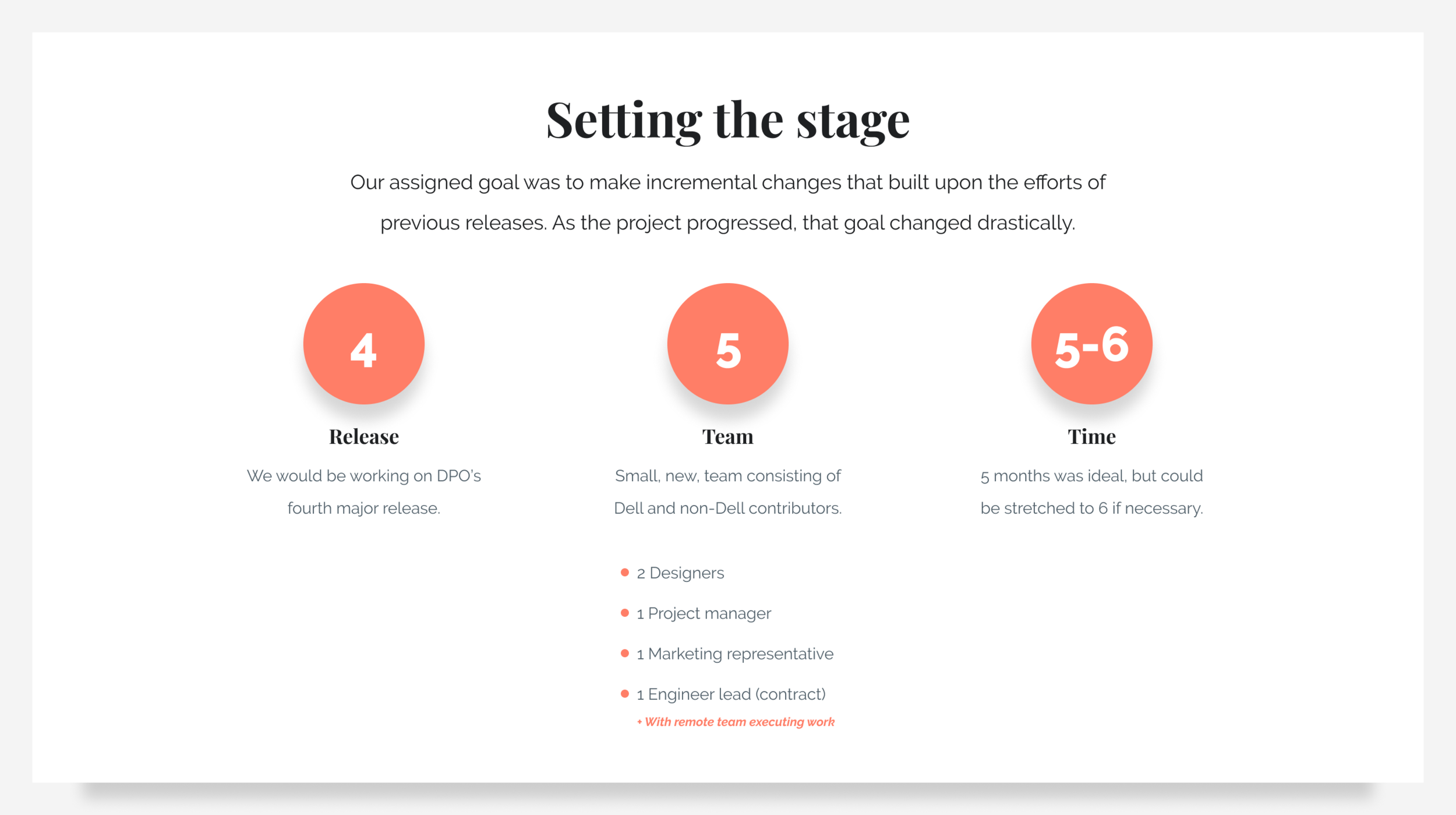
By the time this product arrived on the design teams radar, it was already shipping with Dell hardware and was on its 3'rd major release. With each iteration, a new group of designers, project managers, and engineers were assigned to work on it.
As it headed towards its 4th version, a new team was assigned to understand its history and build a solution that addressed its recurring problems.
Process
Given the relatively quick turnaround this project required, my design colleague and I would need to always be on the same page. We had worked together before and knew that regular check-ins helped ground the project and get everyone on the same page. We would stick to a simple process, prioritizing up-front research over delivering high-fidelity visuals.
Understand the problem
Research
Brainstorm
Prototypes
Form insights
Refine
Document
1 Understand the problem
Our goal was to improve the user experience of DPO ahead of its next software release. In support of that core problem, we would need to understand the products history and core technologies.
We began by speaking with designers from previous releases. Through those discussions, we learned how difficult it had been for the team to add features or improve basic usability. They shared with us that DPO customers had questioned the validity of claims made my DPO sales and marketing. Users simply didn’t trust the product to deliver on its promises. The team behind the 3rd iteration had spent most of their time working on the software dashboard view, and had largely ignored other areas of the UI.
Users simply didn’t trust the product to deliver on its promises.
2 Research
We began our research by gathering information about the past design and engineering efforts. Our goal was to form a base of knowledge we could reference and leverage when we began brainstorming solutions.
2.1 Activities
Become familiar with the current product.
Understand the project history and review the backlog with the past team.
Look for user reviews and publicly available feedback.
Connect with other team contributors (marketing, brand, engineering) to better understand how the product is being positioned and sold.
Understand what technology limitations the engineering team is facing. Agree upon the basics: timeline, feedback loop, tooling, hand-off, deliverables, etc.
2.2 Product review
We then spent time combing through all the internal information we could find on DPO. Unfortunately, there hadn’t been a central repository where all work had been stored. Each successive team had created new ways to store and share information.
We spent time using DPO, exploring every corner of the application and taking screenshots while noting our initial impressions. Fundamentally, DPO was sold as software used to optimize PC performance by creating unique profiles for commonly used third-party applications. Upon launching DPO, users landed on a ‘Home’ view with system and device information. Tabs along the top showed other areas, including ‘Optimization profiles,’ ‘Dell system updates,’ and ‘Analysis.’ There was no onboarding or welcome experience.
2.3 Identifying pain points
After spending a great deal of time within DPO, we had generated a long list of pain points that hindered our ability to actually create profiles for applications (the defining trait of DPO). Some of our initial thoughts:
There was no onboarding to orient or help the user take action
The visual styling complicated the interface. It wasn’t consistent across the software and we weren’t sure what elements were actionable or read-only
We didn’t know what the app wanted us to do
There was loads of information in sight, but it wasn’t obvious why it was included or what it meant
The navigation wasn’t consistent and included dead-ends that made us feel trapped without offering a way to leave or return to previous screens
Typography and color usage varied across different screens. With each change, we consciously had to think about what other information this content should map to
The main user flow was buried and displayed at the same hierarchy level as other, unimportant actions. The flow was clunky and included several separate steps. There was no indication of our progress through it and no status of the task once we were done.
The system offered little insight into the status of profiles we had made
We now understood why users didn’t trust the application. It offered little insight into what it was doing behind the scenes. We didn’t notice any change in performance when running Photoshop, Illustrator, or Chrome. DPO didn’t surface what kind of performance boost we should be looking for, or data into what had been improved. Put simply, there was no transparency and no noticeable performance gains. The application felt static and separate from our machines.
“The software is defective and does not update the computer or the items in the computer. It is pretty sad to see this lack of performance from Dell on a system that is so very expensive.”
2.4 Team discussions
We met with the engineering team and shared our experiences with them. This information was difficult to discuss, as it fundamentally questioned their input and work. What we learned was staggering. The application wasn’t capable of delivering performance gains across all applications. It had only been shown to improve performance in specific testing environments running specific software on specific hardware.
The engineers also shared they were not currently able to monitor how a user interacted with their third-party applications. This came as a bombshell for my colleague and I. How then were they going to improve performance?
Feedback gathered from past users about their DPO experiences.
3 Brainstorm
After discussing the issues with the development team, our focus shifted to reflect what we had learned. We didn’t want to improve the visuals without addressing the product shortcomings so many users had clearly noticed.
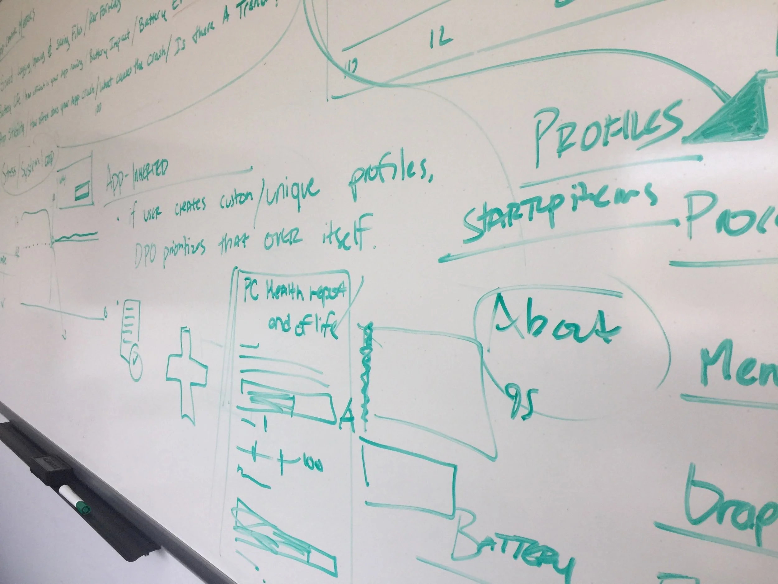
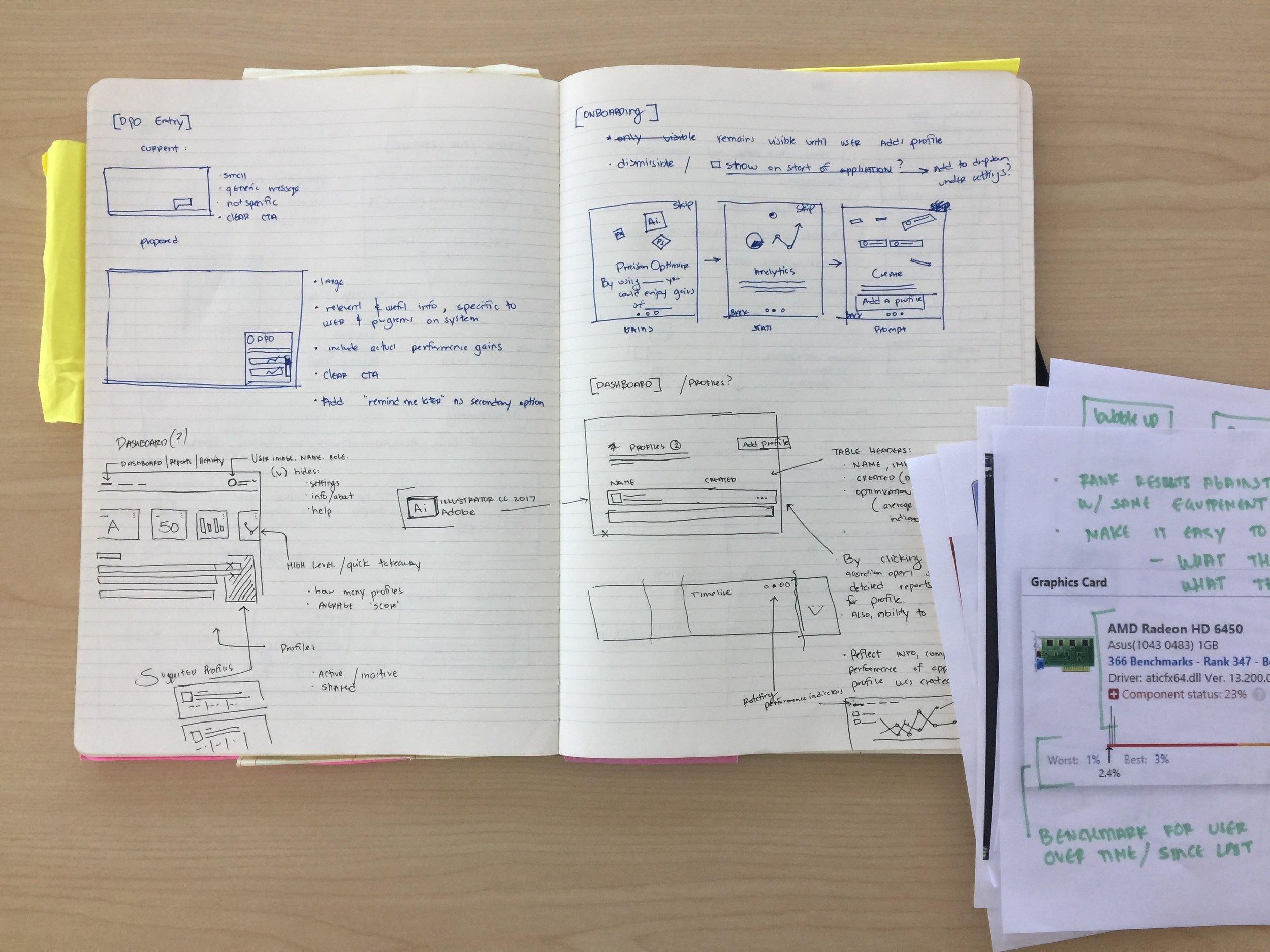
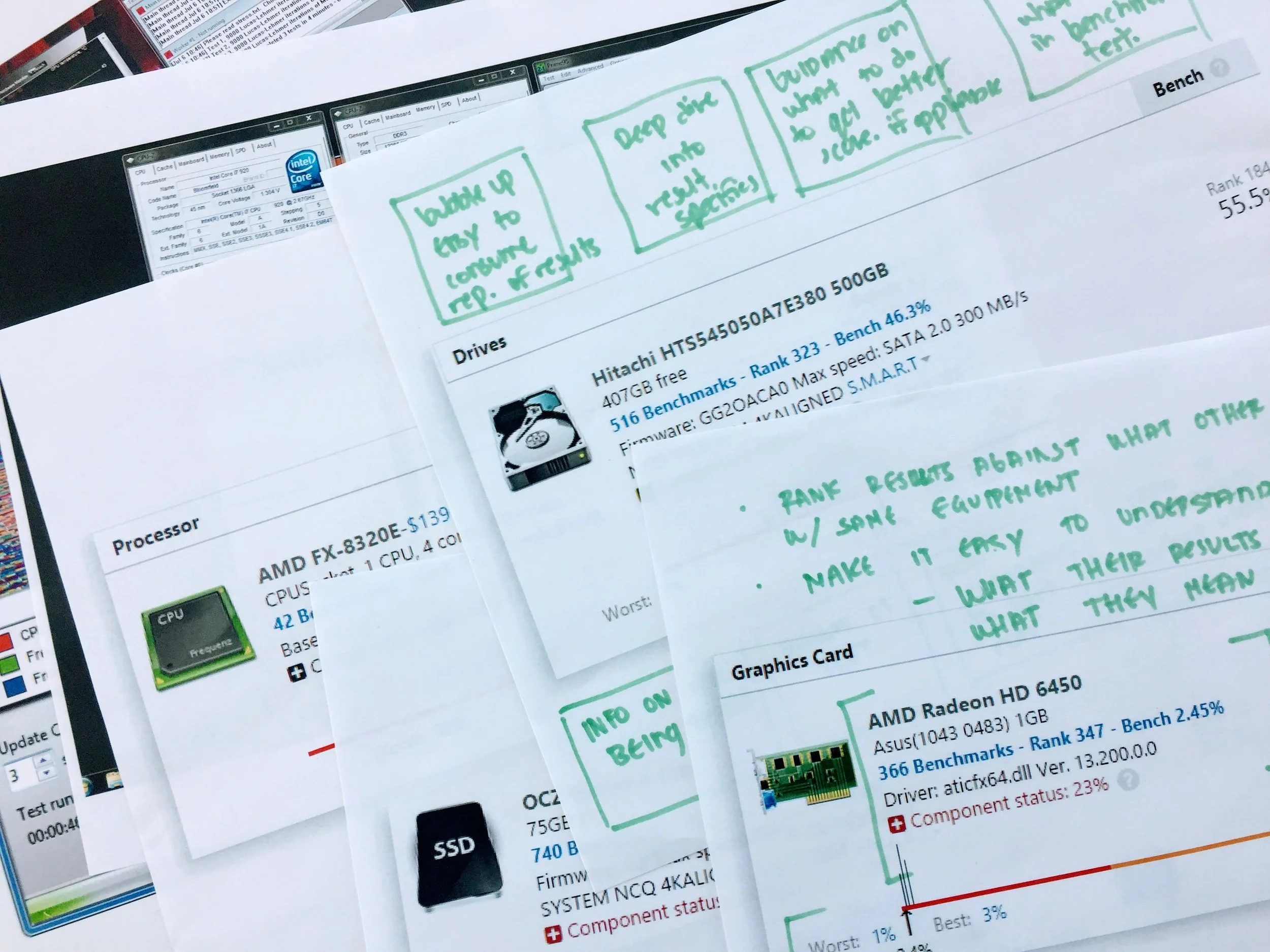
We set out to quickly unload ideas and brainstorm solutions. We set up a temporary war room and began white boarding, inviting the other team members from marketing and engineering to work there whenever possible.
Since our focus was prioritizing very specific aspects of the user journey, we started there. We quickly realized that we’d simply be pushing the problem onto future design teams if we didn’t consider how decisions we made would impact other areas of the product.
Unload ideas
Whiteboard with team. Sketch, draw
Generate user flows (focusing on onboarding and task completion)
Generate task flows (focusing on adding appliances and creating profiles)
4 Prototype
Creating prototypes helped my design colleague and I explore the user and task flows. They also helped communicate our ideas to the marketing and development leads. Initial prototypes were very rough, in fidelity as we felt more confident that key aspects were locked and unlikely to change.
4. 1 Design directions
Following the difficult discussions around the validity of the program, my colleague and I began working on two different design proposals.
We would deliver a version that matched the project proposal we were initially given where we would focus on improving the navigation, user flows, visual style, and transparency of information. The design would be a result of looking at the complex tasks facing the user and looking for ways to simplify and streamline that experience.
The second proposal would be a future concept that wasn’t limited by the current engineering team. It would include a heavy focus on leveraging machine learning to offer real performance boosts to users after monitoring how they interacted with their PC. It would also focus on sharing those performance gains across teams. We knew this proposal would likely be a good discussion piece, but nothing more. Either way, we wanted to preserve the inevitable product direction we saw and provide a solid starting point for future DPO teams.
5 Form insights
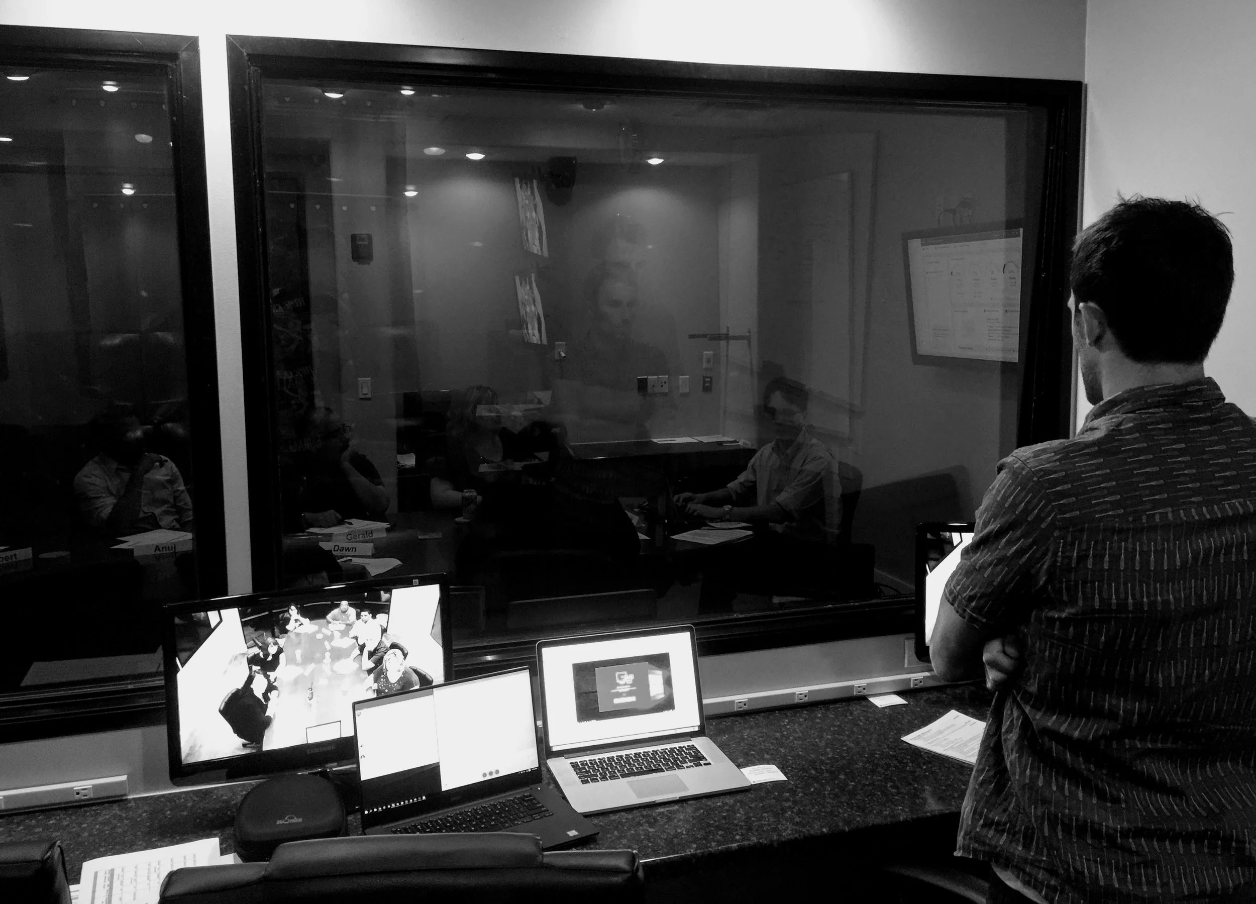
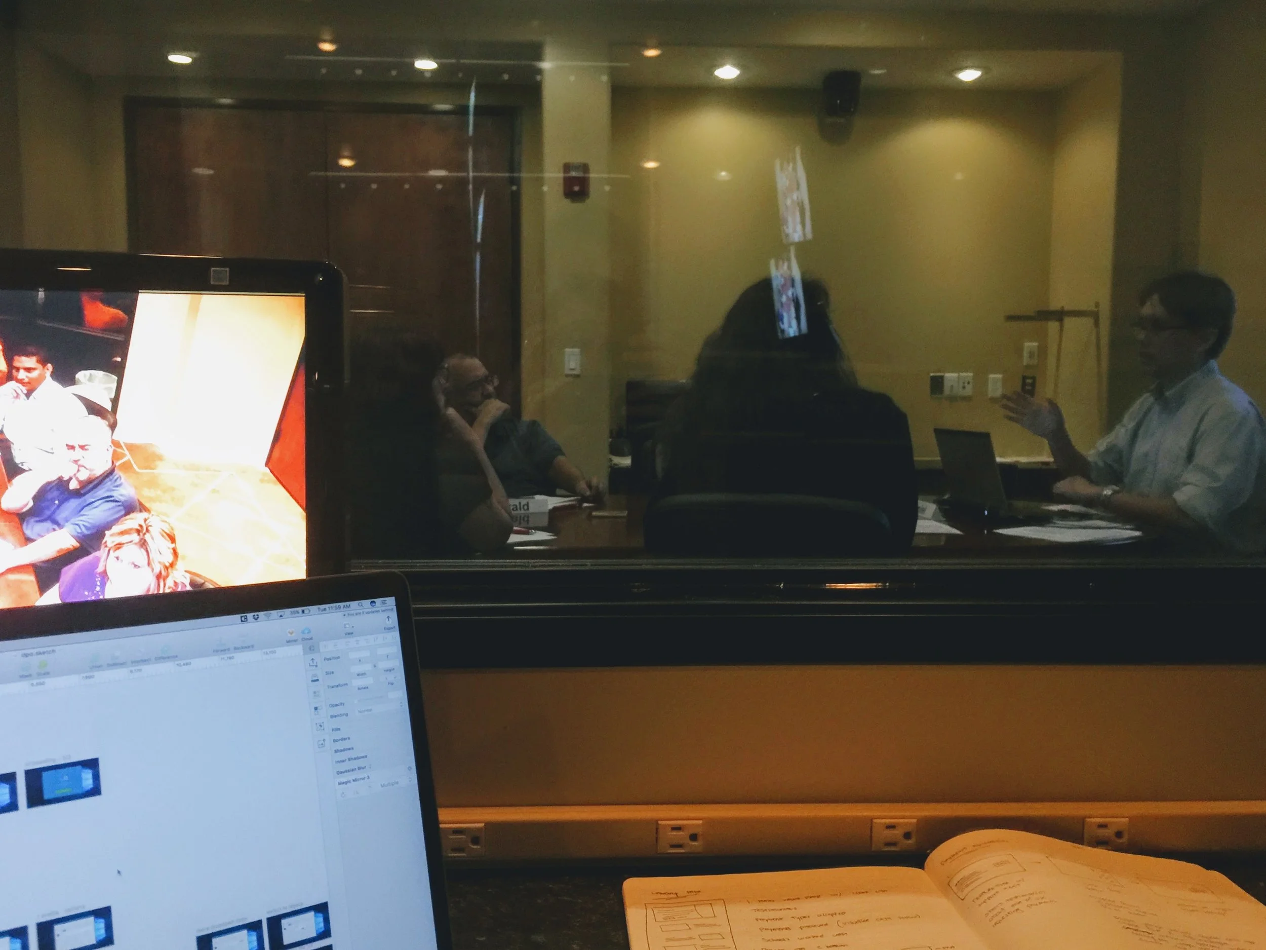
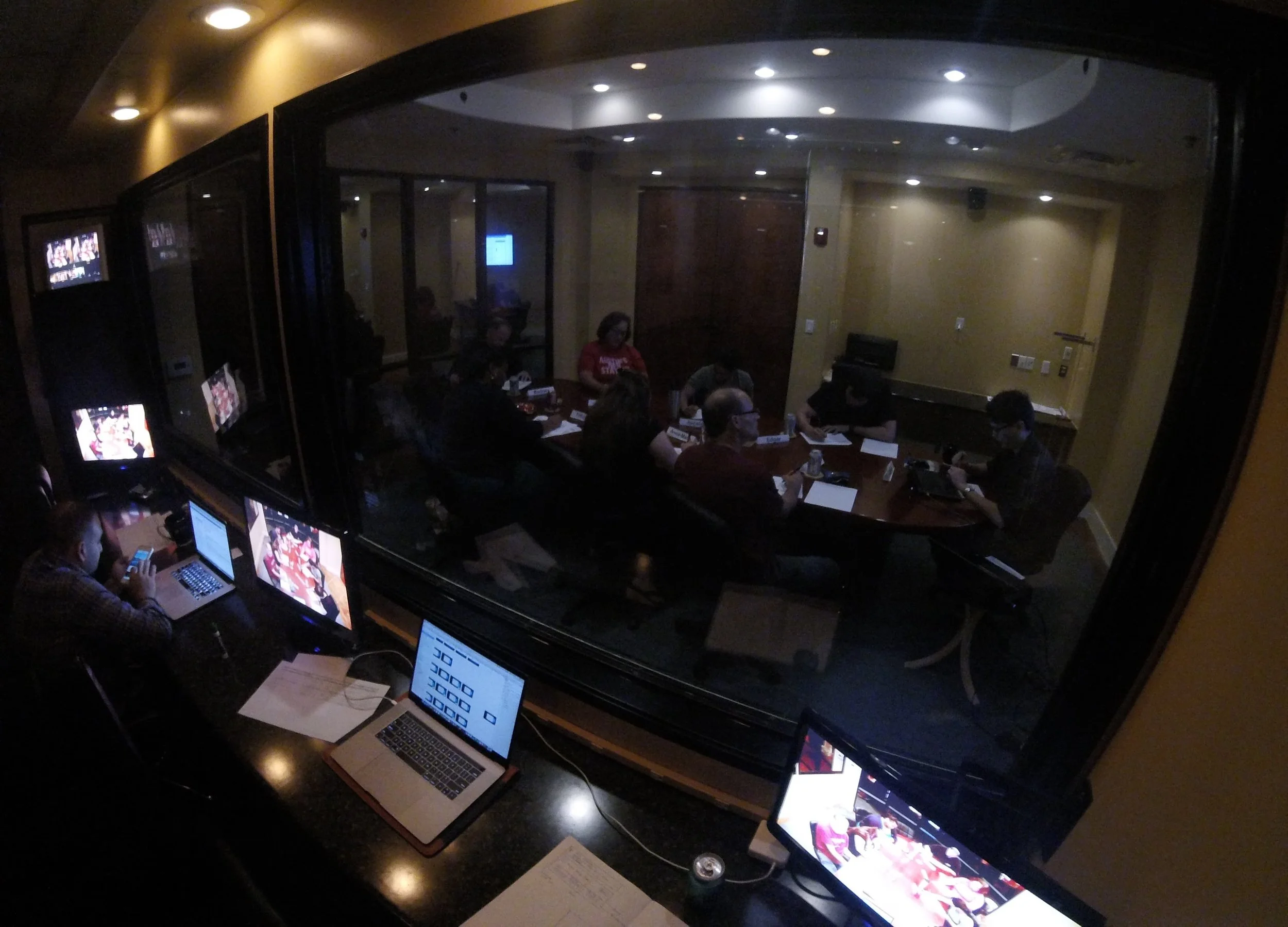
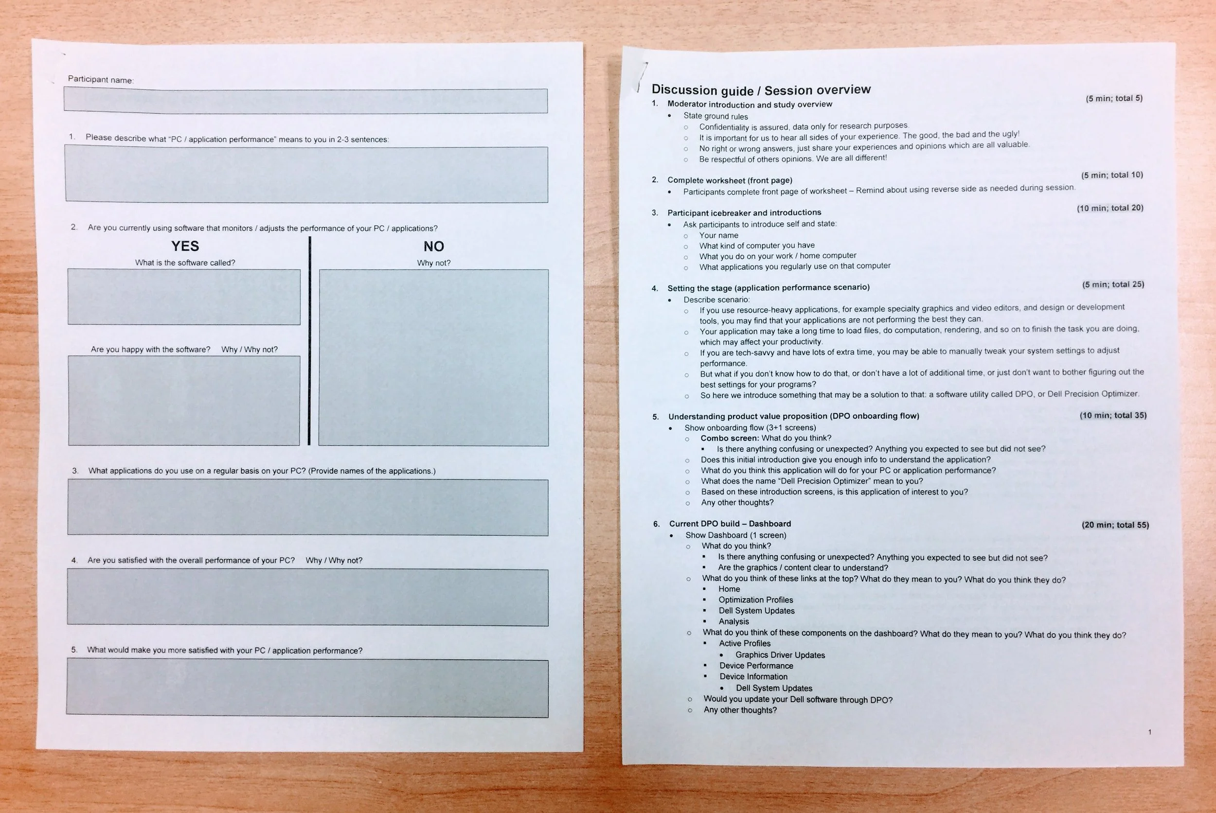
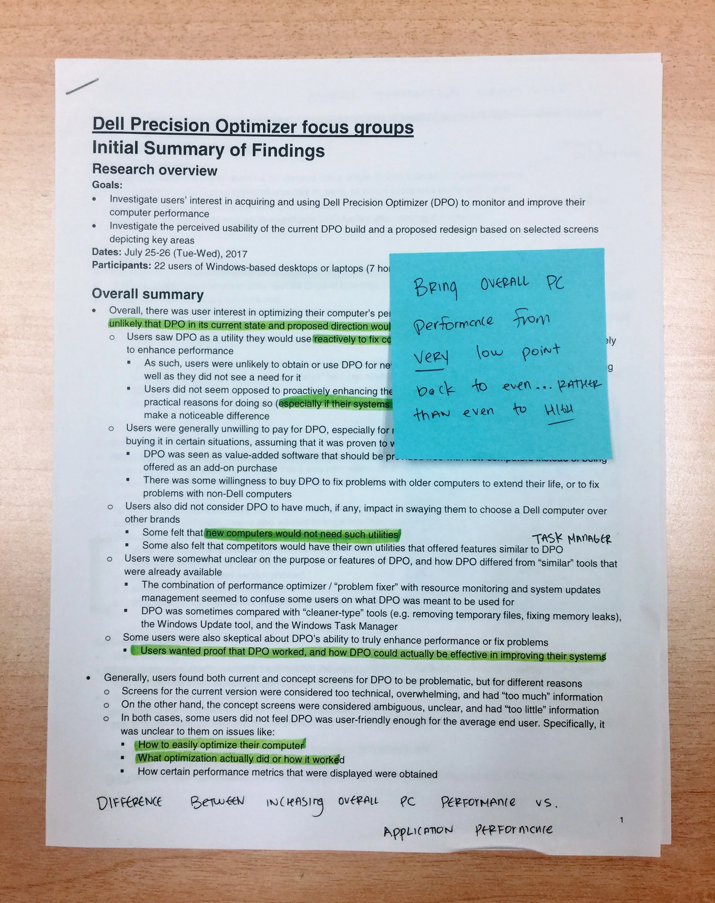
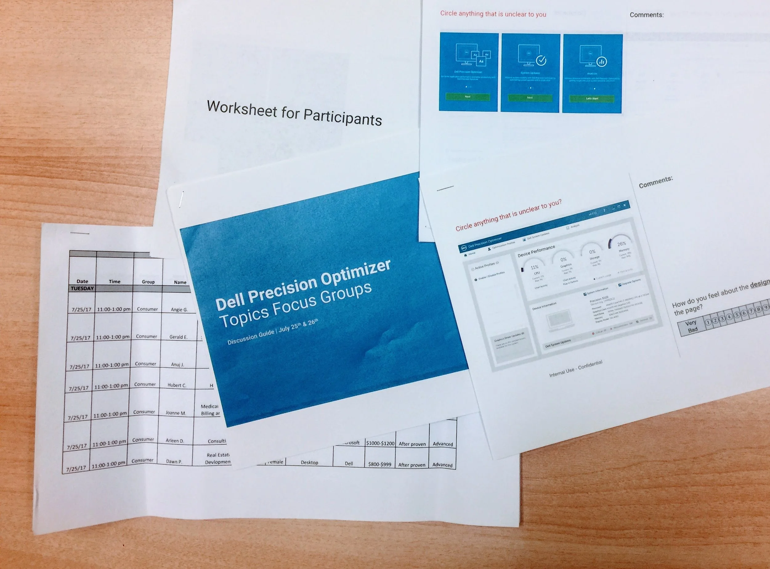
To validate design assumptions we made while testing different prototypes, the DPO team conducted a 3-day, 24 participant user study. My design partner and I collaborated with an Austin-based research agency. They would be conducting the study that we put together, while we observed users and took notes.
5.1 Study goals
We had a lot planned for this test. We wanted to gauge users understanding of ‘appliance performance’ and ‘program profiles.’ We also wanted to test different task flows. With any extra time, we wanted to gauge their interest in the future concept we had quietly been working on.
While testing, we hoped to uncover major usability issues, test various task & user flows, and measure user confidence in the applications ability to deliver on the promise of increasing system performance
5.2 Scenario testing
We chose to test some of the core task flows with our live users. These were tasks that had generated lots of negative feedback on previous versions, so we were excited to see if our design changes yielded any improvements. We tested the following flows using both the previous design and the version we had created.
Task 1: Create a new performance profile
Task 2: Edit an existing profile
Task 3: Share an existing profile with a colleague
After the first day of testing, my colleague and I poured over our notes and discussed the results with the testing host. We were able to see what prompts were generating the best discussions and which were confusing for users. With this insight, we made changes to the discussion guide and prototypes before the start of day 2. We took this same approach to the final day of testing, although the previous changes yielding the biggest improvements.
6 Refine
Once we had a better understanding of what was working and what wasn’t we began refining the prototypes and design assets. Most (if not all) of our designs would leverage existing components and patterns. Adding anything ‘new’ would most likely be pushed to future releases.
6.1 Improvements
We improved the overall UI by streamlining what actions were available to users. We focused on simplifying complicated processes and adding context to help users make informed decisions.
Focus on improving user experience by simplifying process flow and adding education/background through the on boarding sequence.
Removing excess processes wherever possible. Cleaning up UI to help users understand HOW to perform tasks.
Set groundwork for future design revamp of rest of DPO.
7 Document
As we began to understand more about the existing product, the more we were convinced that improving one area of the UI and ignoring the rest was not the answer.
7. 1 Backlog
There were a lot of features and experiences that didn’t make their way into the shipping version of DPO. Equally as important, there is a long list of questions we were not able to answer. Here are a few backlog items we generated to keep track of these issues:
What can DPO automate to improve PC efficiency?
What actions do users trust to be automated?
How can we incorporate machine learning within DPO to better understand the unique styles a user demands of their machine? Is there a way to share that knowledge across systems within a team, or even broader across all users?
Prioritize real world use cases over results made in test environments (lab tests, controlled studies, etc.).
Lessons learned
As our work began to wind down, my colleague and I took time to reflect on this project. We were happy with the progress we had made and the scalable approach to design that we introduced to the engineering team. Due to the nature of our work at Dell, it remains a challenge to pinpoint what the makeup of future DPO teams will look like, who will be on them, and what information will be shared with them. Our hope is that they will approach their time on this project with a clear understanding of what went well and what difficulties previous teams overcame.
This project was interesting to say the least. In many ways it was an excellent experience that gave me the opportunity to participate in new areas of design (formal case studies, in-depth engineering discussions, brand directions, etc.). In others, it was a frustrating and politically fraught example of what can happen at large companies with little oversight. Looking back, I wish we hadn’t waited so long in the process to discuss some of the users feedback concerning the softwares ability to actually deliver results. I can only speak for myself, but I believed far too long into this project that it couldn’t be true. I attributed it to a lack of transparency and sharing information with users. To find out otherwise was difficult and changed the direction of this project.
I was blown away that a product could exist in the marketplace by only offering a fraction of the results that it claimed to deliver. My hope for future DPO teams is that their work begins with delivering actual performance gains for actual users. Visual design, navigation, etc. can all be improved for sure. But the product has to first deliver before anything else. As powerful as design is, it simply cannot fix an engineering problem of that scale.